

- Tutorials
- Create user stats dashboard
Tutorials
Create user stats dashboard
Home dashboard is used for display general purpose panels, now, we want to display some user stats, we can create a new dashboard.
Create dashboard
- Click
+Button on the bottom section of sidebar, you will seeNew Dashboardtab is already selected. - Set dashboard tilte to
User stats dashboard - Click
Submitbutton
The page will automatically redirect to the new dashboard, it is empty now, let’s add some panels to it.
Add graph panel
Click + button on the top right corner of dashboard, you will see a panel named New panel 1 is created, so weird.. why it looks like the welcome panel in Home - , -
Yep, welcome panel is absolutely no use for user stats cases, let’s modify it to show user’s request duration stats.
- Click panel title and select
Editto open panel editor. - Change title to
Request duration statsinPaneltab - Click
visualizationsection inPaneltab and selectGraphpanel
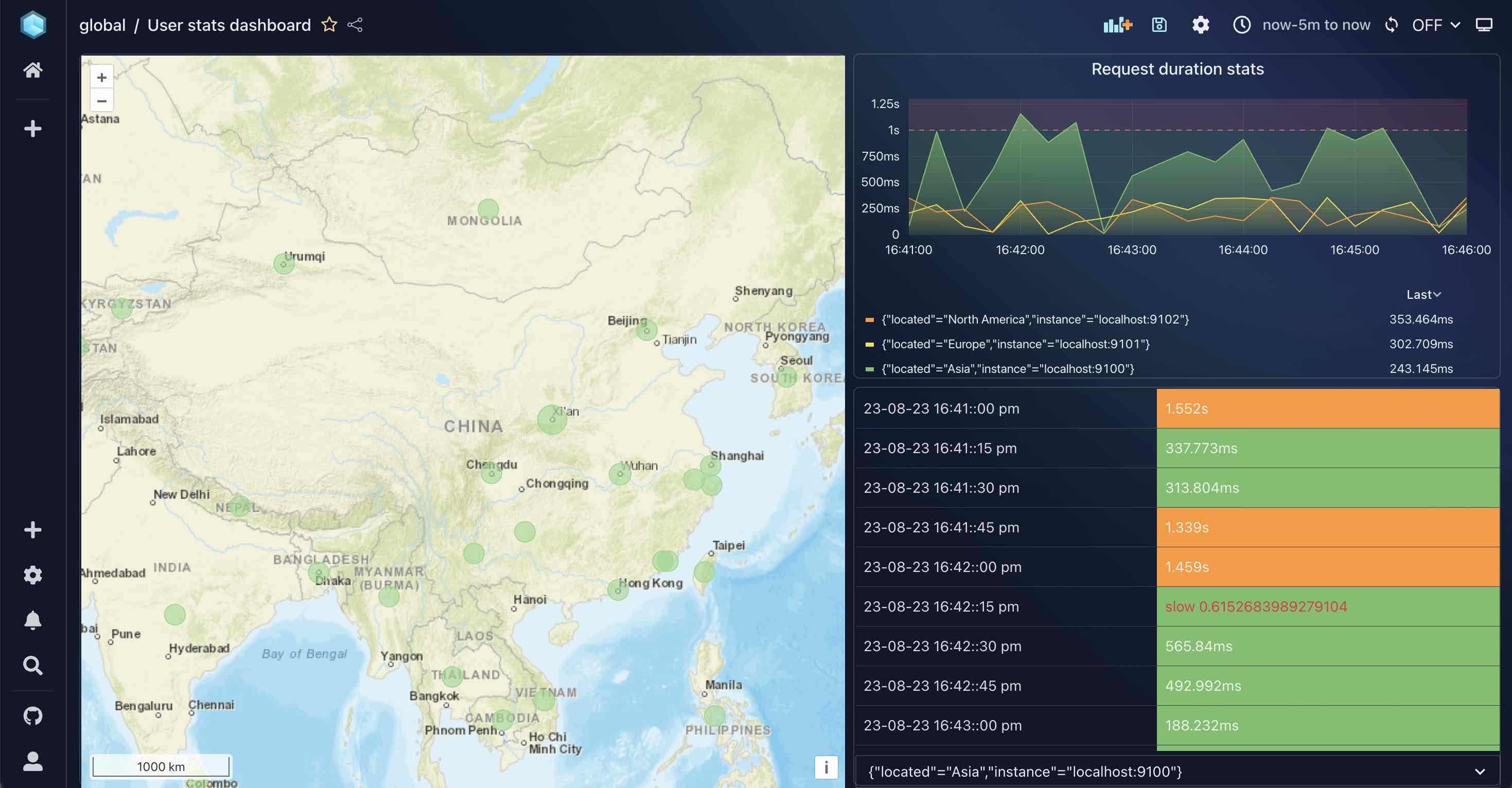
A beautiful chart will show:
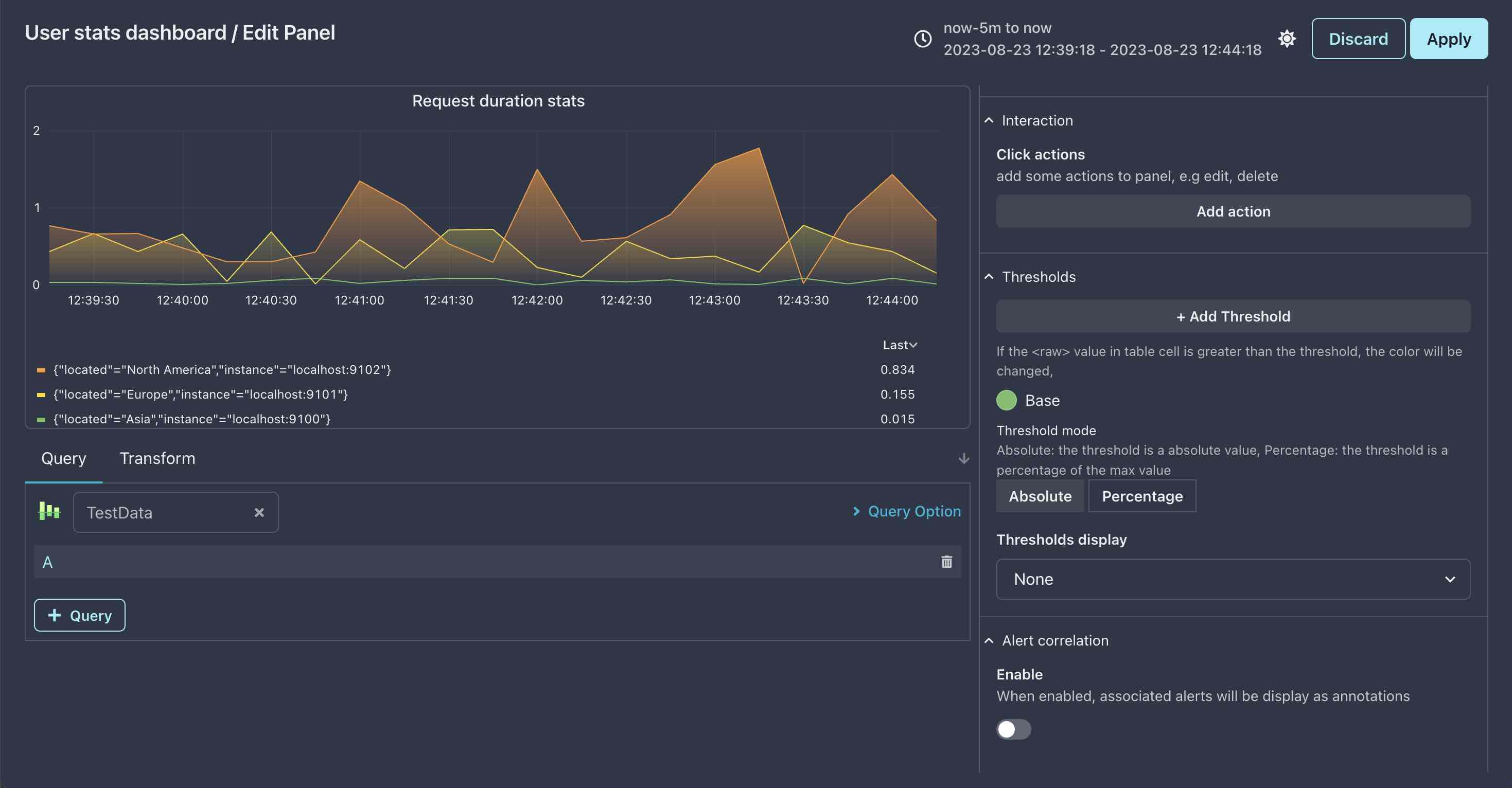
In the chart, you can see three series, they are representing users from Asia, Europe and North America, and their request duration changes over time.
TestData datasource
You may wonder where the data comes from, we have not set any datasource for this panel, how can it show data?
In fact, xObserve has a built-in datasource named TestData, it is used for testing purpose, and it is very useful for new users to get familiar with xObserve.
When you select a panel visualization, xObserve will automatically query mock data from TestData datasource, so you can see the chart rendering immediately.
You can see the info of panel datasource on left bottom of panel editor.
Add units
This panel is all about duration, but we can not see any duration units in the chart, let’s fix it.
- Find
Valuesection inPaneltab - Select
TimeinUnitdropdown - The current base unit is
ms, but our stats is insecond, so we need to change base unit tos(base unit is determined byx1 or/1) - First select
Time, then selectCustominUnitdropdown
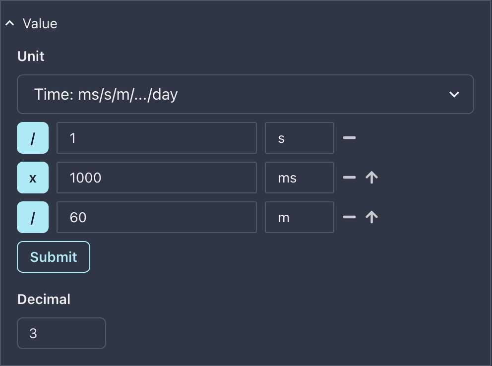
Modify your unit to the value shown in the above image, and click Submit, now you will see chart will show duration unit as expected.
Dont forget to save your dashboard after you have made changes to it, you can press
Ctrl+Sin panel editor to save it.
Add threshold
Now, we want to add a threshold to the chart, so that we can easily find out whether our users are experiencing long request duration, this can have a significant impact on their using experience.
- Locate
Thresholdsection inPaneltab - Click
Add Thresholdbutton - Set values as below image
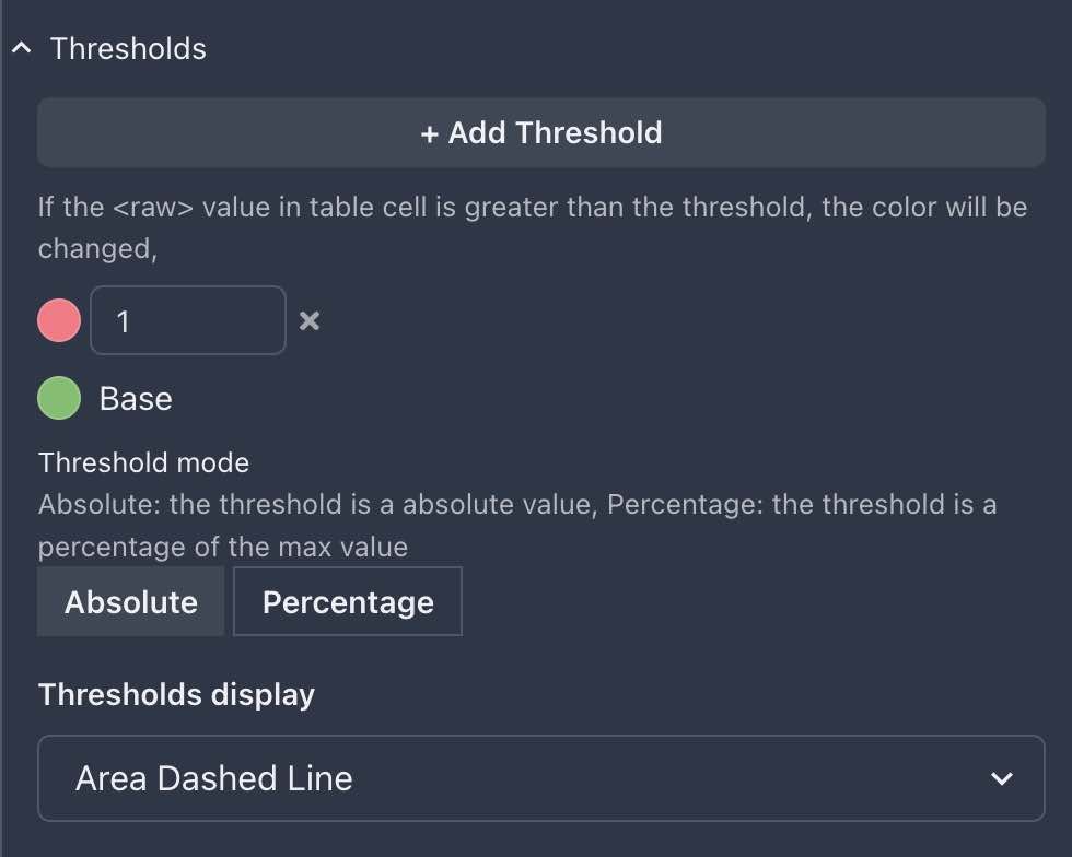
Now, you will see a red line in the chart, and the chart is split into two parts, the upper part rendering in pink-red color is duration larger than 1s, and the lower part in green color is duration less than 1s.
For more info, please refer to Threshold
Add Geomap panel
Our boss wants to know where our users come from, so we need to add a Geomap panel to show user’s location and request count.
Apply the previous changes and go back to dashboard , then click add panel button to create a new panel.
- Open panel editor and select
GeomapinVisualizationsection - Set panel title to empty, because it will make our map ugly :(
At this moment, you should see as below:
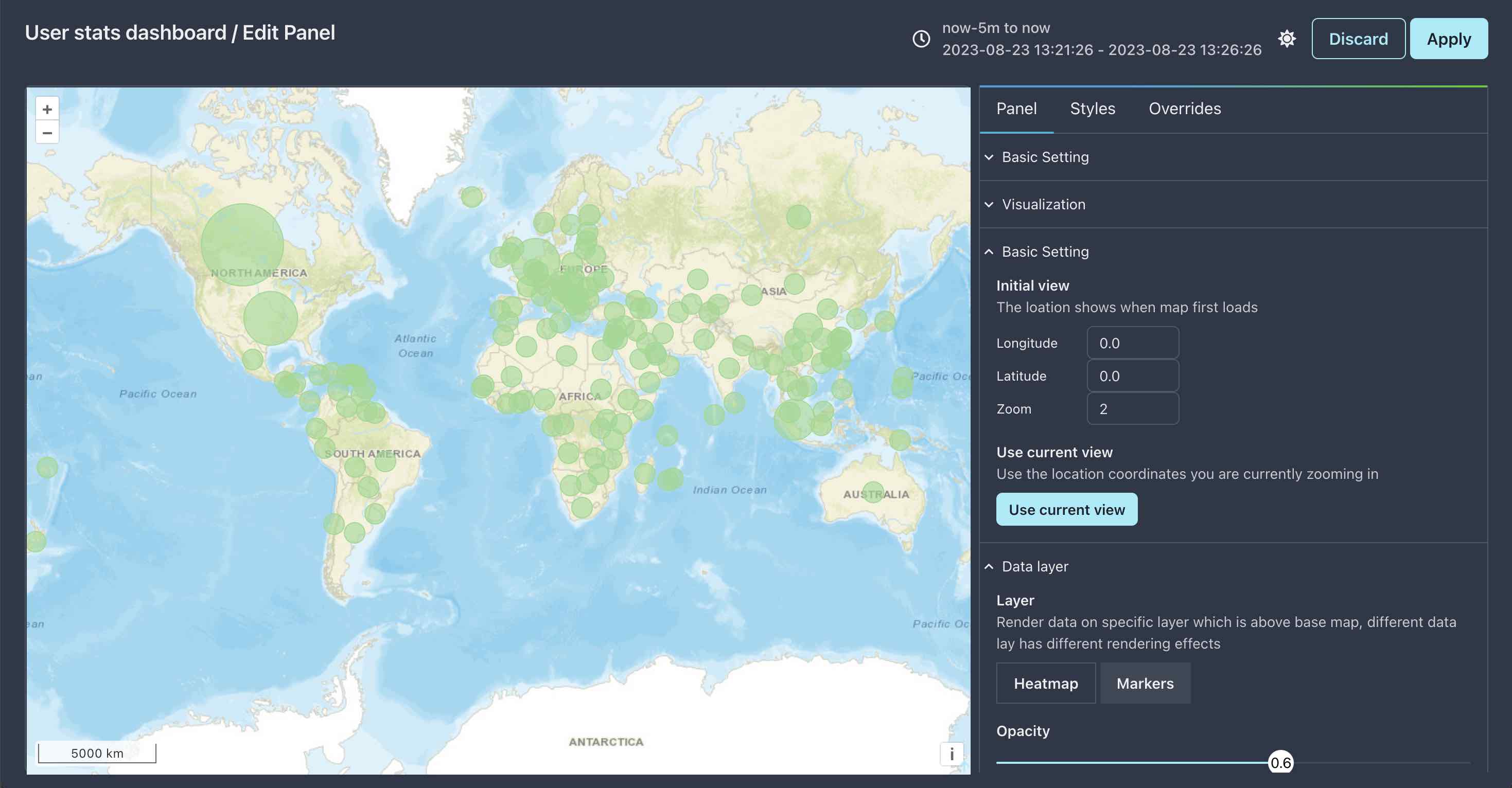
If you cant see any map, just green points, please check your network connection, because the map is loaded from internet.
The green point on the map represent a country or a city, the bigger the point is, the more requests come from that location.
Focus to a country
We can see the default world map is too large, let’s focus to a country, let’s assume you are from China, and you want to focus to China.
- Find China on the map, you can using mouse wheel to zoom in and out
- Click on
wuhanpoint, and zoom in/out to adjust the map to your favorite size, or you can ignore clickingwuhan, just use mouse wheel to find a suitable size for displaying China map. - Find
Basicsection inPaneltab, and clickUse current viewbutton
this will set current view as default view for the map, Apply and save dashboard, then refresh the page to see the effect.
Click event
If you click on a green point, the map will automatically zoom in to that point, you may think that is provide by the map, but the real answer is no, it is provided by xObserve.
You can define various interactivity for various panels in xObserve, including Geomap panel. Just have a look at Interaction section in Panel tab, for more info, please refer to Interaction
Add threshold
What if we want to render points in yellow color when request count is larger than 1000, and red color when request count is larger than 10000?
This is left to our readers as an exercise, the answer can be found here.
Add table panel
Sometimes we hope to see our data in table format, so we can easily find out the top 10 users, or top 10 countries, etc.
In this sectino, we will make a simple table to show the request duration over time, yep, that’s the same data as the previous Graph panel, but in different representation.
- Add a new panel and open Panel editor, then select
TableinVisualizationsection - Set panel title to empty
- Turn off
Table Setting > Show headerto hide table header - Add time units to table as previous Graph panel ..wait, where is units section?
Obviously, there is no Unit section in Panel tab, so how can we add units to table?
The reason Table has no units setting is simple: Table columns should has different units, for example, the first column is Time, the second column is Value, they cant have the same seconds unit.
Luckily, in xObserve we can achive this by using Override feature.
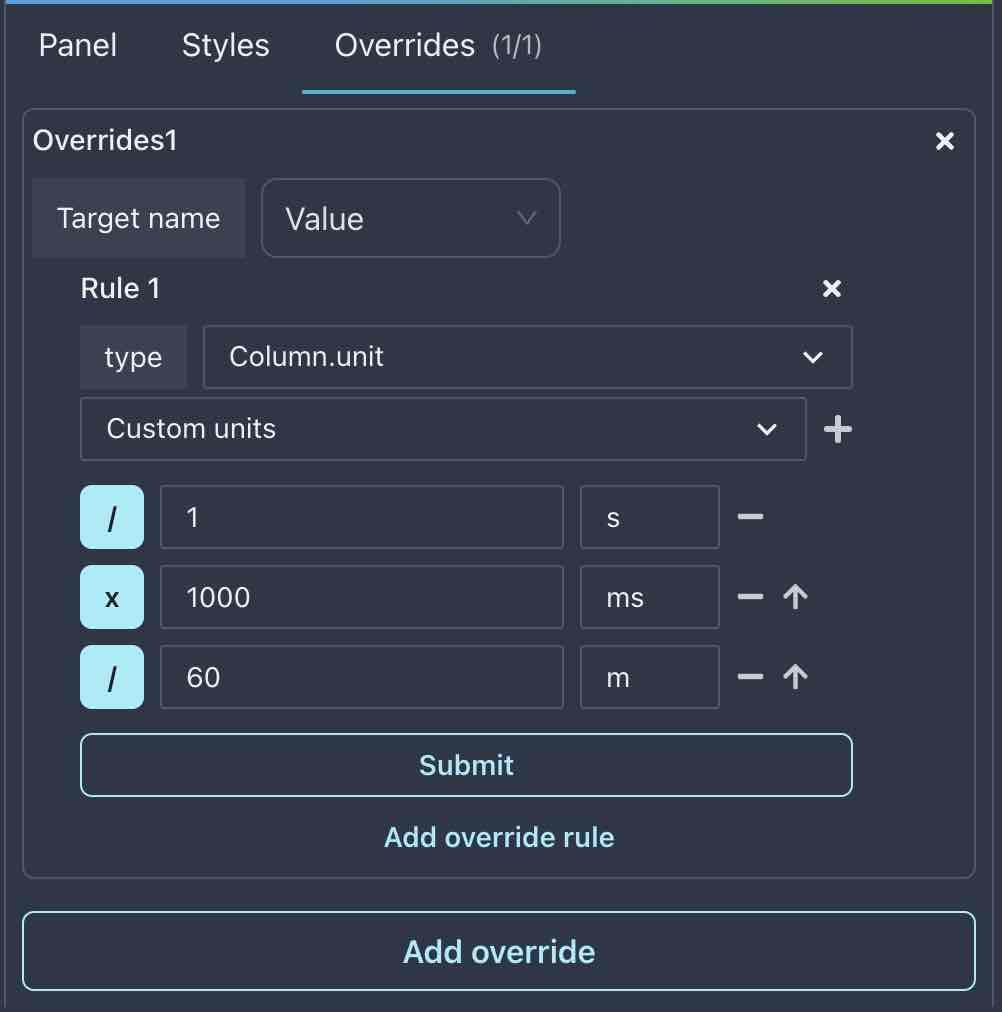
Override the column units
In xObserve, nearly all the panel types provides Override features, they are used for ovverride the default settings of panel for specified series or columns.
- Select
Overridestab next toPaneltab - Click
Add overridebutton - Because we need to add units to
Valuecolumn, thus selectValueforTarge name
Now, we have created first override for Panel, and its target is Value column in Table, next, let’s add rules to this override.
- Click
Add override rulebutton - Select
Column.unitfortypefield - Set units, same as previous Graph units
Don’t forget to click Submit button to make units setting take effect !
Mark value with color
In previous sections, we have saw how thresholds are added to Graph, Geomap panels, and what they looks like. But in table, there is a bit different.
In table panel, threshold is similar to units, we need to use Override feature to add it. Also, there is another way to achive the same goal, we will talk it later.
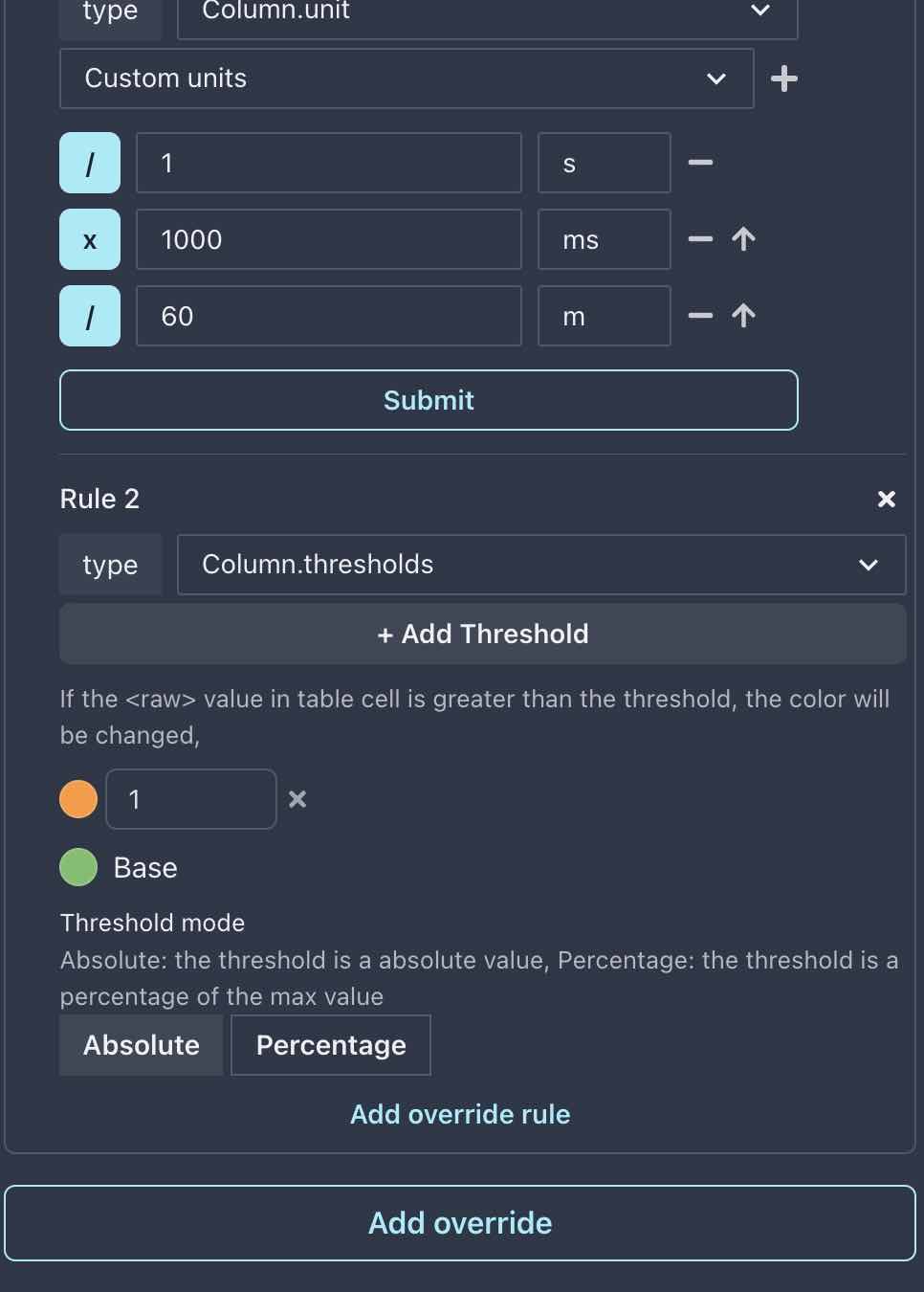
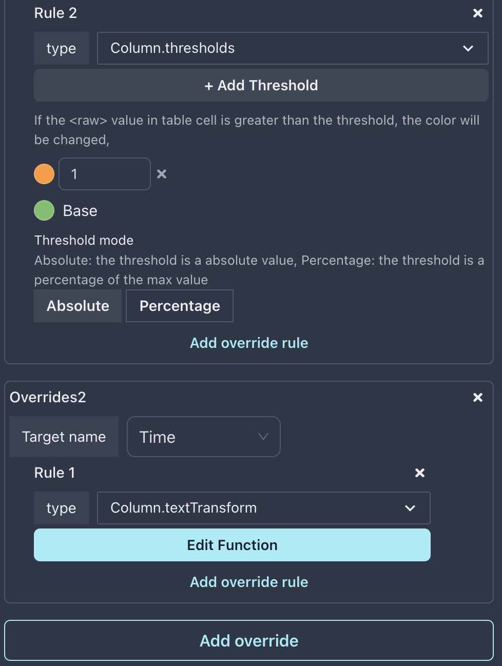
Add threshold using Override
As you already know how to add threshold and override, so we will not repeat it here, just add a new override rule for Value column, and set threshold as below:
Value mapping
What if you want to mark a range of value with a color? For example, you want to mark value in range [0.6, 1] with red color.
Apparently, using threshold can make it work, but what if we have more complex requirements? For example , we want mark cn string values as 🇨🇳cn ?
In a word, value mapping is used for map a value to another value, it is very useful for table panel.
Lets mark value in [0.6, 1] with red color. This time we can use Value mapping in Panel tab, we also can use value mapping in Override tab, let’s choose the first one.
For more info about value mapping, please read value mapping in Table.
For now, find the Value mapping section in Panel tab, and click Edit value mapping button, then set value mapping as below:
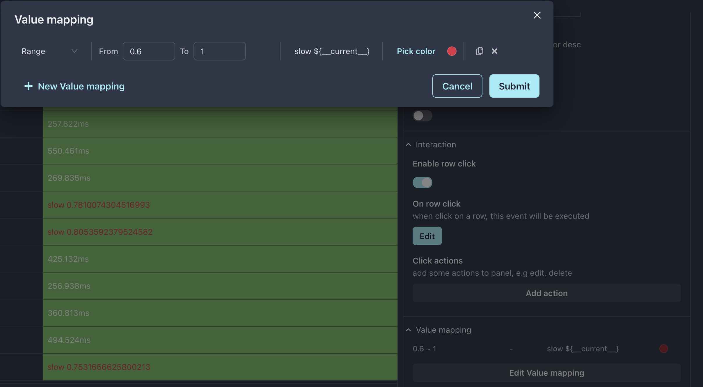
Same rule exist, which takes effect?
Look, they are all there. Threshold color and value mapping color can be seen at the same time.
So, here comes the question: if we have values mapping in Panel tab, we also set values mapping in Override tab, which one will take effect?
The answer is: smaller scope override large scope, that is to say, value mapping in Override tab will take effect.
Make time column readable
Timestamp as 1692778335 is never readable, we need to convert it to a human readable format, for example, 2023-08-21 12:00:00.
Another time to use our Override weapon, but the override created before is for column Value, so we need to create a new override for column Time.
Here, Column.textTransform is a function, it will be called for each value in Time column, and its return value will be displayed in Time column.
Let’s have a look at the function, click Edit Function button, you will see below code in the editor modal:
function transform(text, lodash, moment)  {
    const t = moment(text * 1000).format("YY-MM-DD HH:mm::ss a")
    // if you want to use t, just modify the return statement below: change text -> t
    return text
}
The demo function already implement datetime format change for us, all we need to do is modify the return statement to return t rather than the raw text.
function transform(text, lodash, moment)  {
    const t = moment(text * 1000).format("YY-MM-DD HH:mm::ss a")
    // if you want to use t, just modify the return statement below: change text -> t
    return t
}
modify to above code, and click Submit button, check Time column, it should be readable now.
For more info about transform functions, see data transform
Adjust panel size and position
Now, we have three panels in our dashboard, but they are quite small, particularly the Geomap panel, let’s adjust their size and position.
First, you need to go back to the dashboard view ( from panel editor).
When you hover over the Graph panel, you should notice a resize icon on the bottom right corner of the panel, similarly, when hovering over panel header(excluding the title area), the mouse cursor will change to move icon. The former is used for resizing panel, while the latter is used for moving panel.
The next operation is simple: click on the icon and drag it to resize or move.
Now adjust the panels to below image:
Not bad, right? Let’s try to use some datasource to replace the mock data, real is the best!