- Panel
- Overrides
Panel
Overrides
In xObserve, you can set options for overall charts, when these options is set, every series in the chart will inherit these options.
But somtimes we hope to override some options for a specific series, now you can do it with Panel Overrides.
Create a panel
First, create a panel and select Graph visualization, then add datasource queries as below:
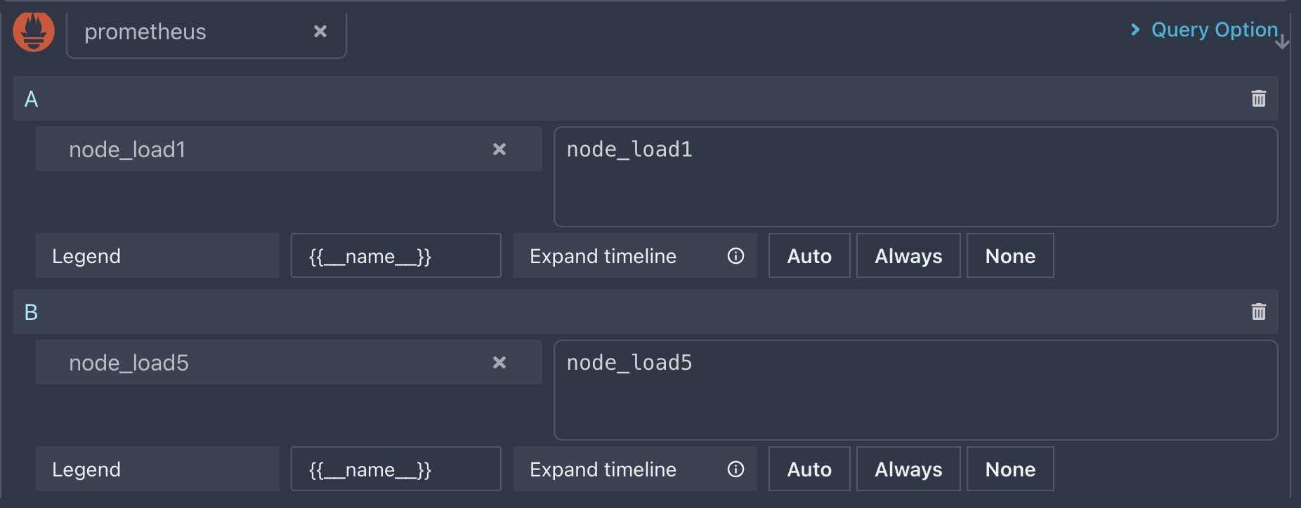
Don’t forget to set Legend field to {{__name__}} to display their series name in graph legend.
This panel will be reused in the next
ThresholdsandInteractivitydocs
Set common options
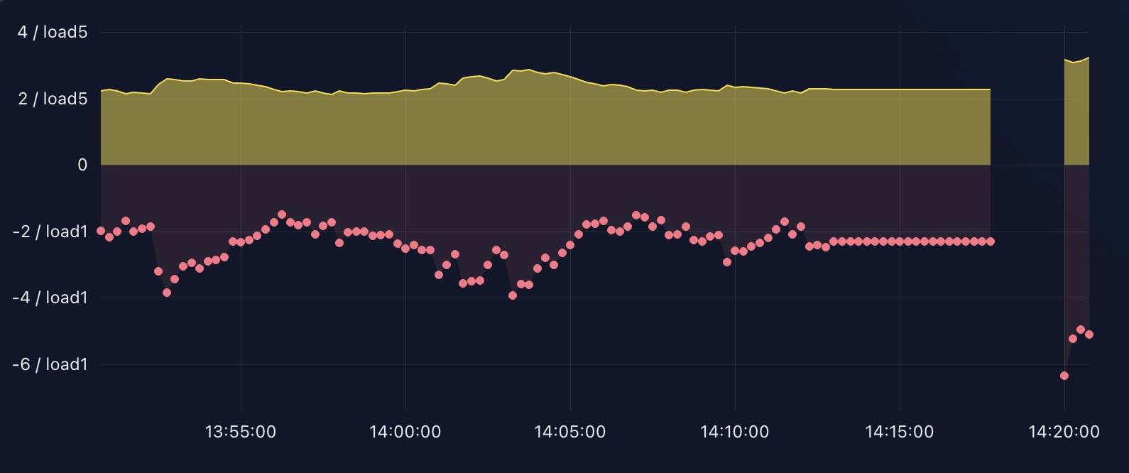
Now, you can see there are two series in the Graph chart: node_load1 and node_load5, let’s set some common options to them.
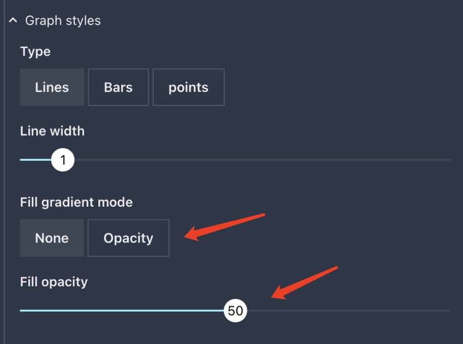
area fill
The below options will change the area fill style of all series in the chart:
unit
Now, let’s set the unit of all series in the chart:
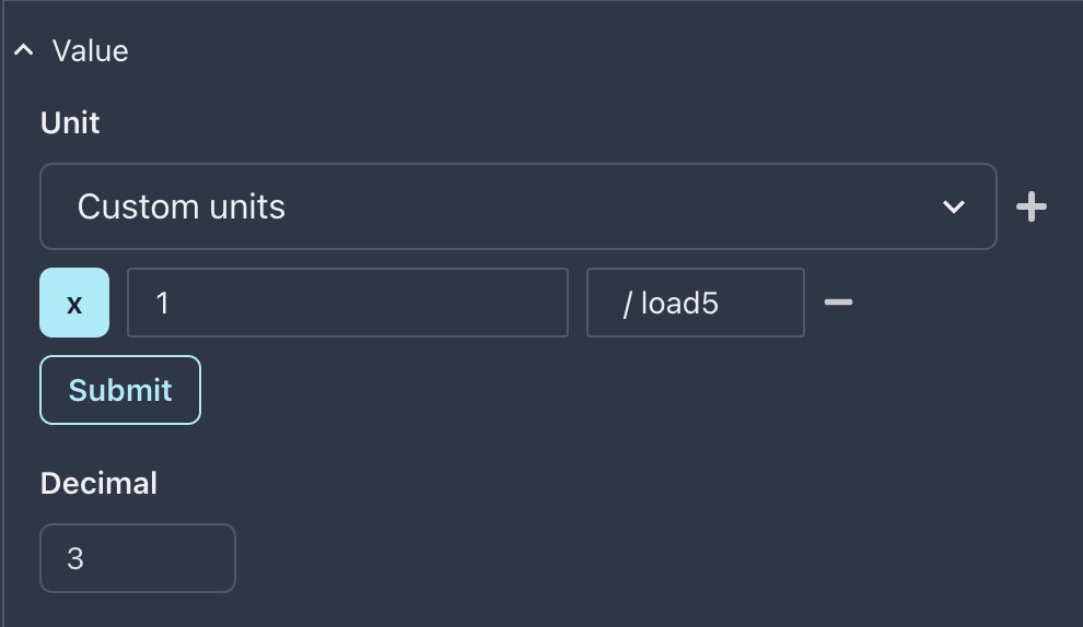
It should be noted that value in Unit is actually / load5 with a space char at the beginning.
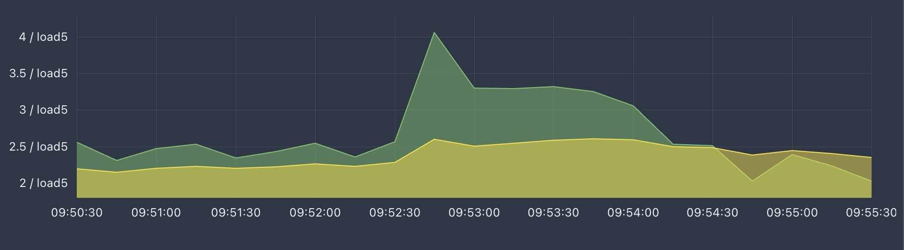
This is a bit weird, load1 series is also using a load5 unit. Let’s fix it first.
Override options
To fix the unit issue, the only way is to override the options for load1 series.
But if you look at the Graph panel, you will find that there is no Y-axis space for load1 series to show its unit / load1.
So we need to add a new Y-axis for load1 series, and set its unit to / load1:
Add override item to load1
Click Override tab and add a new override for load1 sereis as below:
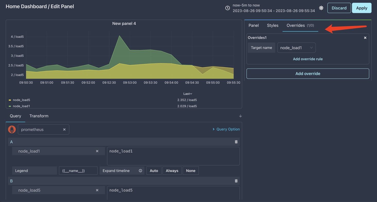
Add Y-axis override
Click Add override rule and select Series.separateYAxis type ,then enable it as below:
Where the arrow points to is the new Y-axis we set for load1 series.
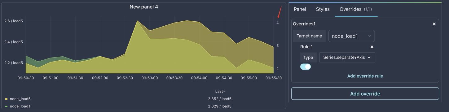
Now it’s time to set its unit.
Add unit override
Click Add override rule and select Series.Unit type, then set its value as below and click Submit button:
Nice, now the load1 series has its own Y-axis and unit.
But there is also a problem: the load1 and load5 series are shown mixed together. Maybe we should separate them.
A viable approach is show load1 in negative y-axis.
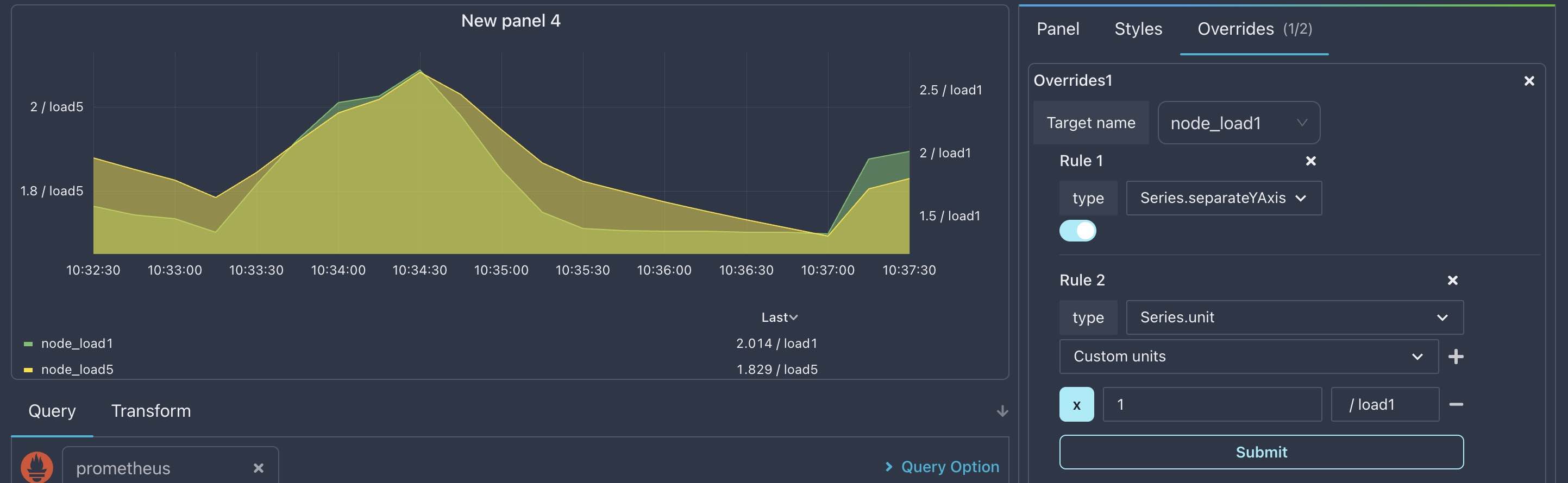
Add negative y-axis override
For now, we don’t need separateYAxis any more, so change it to negativeY as below:
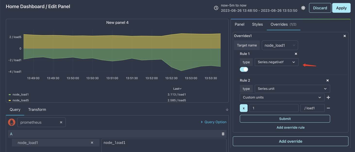
Ok, the two series never mixed together now and the units is also correct. Let’s override some styles next.
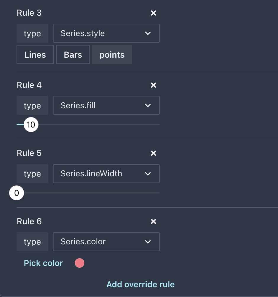
Override color and fill
Add some overrides as below :
- Override
Series.styleto changenode_load1series fromLinestype that set in common options toPointstype - Set
Series.fillit to10fornode_load1to make it less opacity - Remove the line from chart by seting
Series.lineWidthto 0 - Assign a new color to
node_load1rather than using a default color by seting theSeries.coloroverride
Final result
After all these overrides, the final result is not bad: