- Panel Plugins
- Graph for timeseries
Panel Plugins
Graph for timeseries
For timeseries data, the most used panel is Graph visualization.
Its x-axis is always time, and y-axis is the value of the metric, because of this, the Graph panel is the born for timeseries data.

Next, let’s see how to configure some of the options.
Connect null values
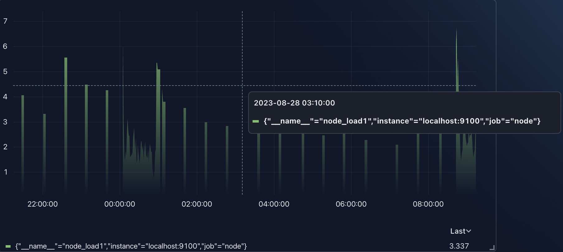
When query data from datasource, if there is no data in some time points, the panel will show a gap in the graph.

There many gaps in this graph, if hover on one of them, you should see a tootip with no value as the above image.
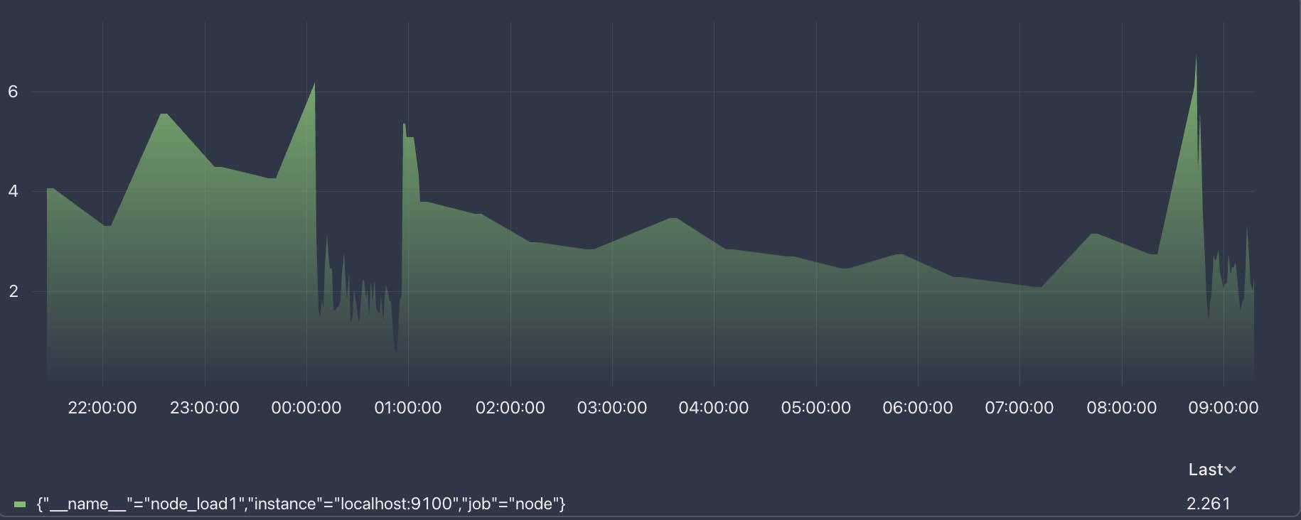
If we checked the Connect null values option in Graph styles section, the panel will connect the null values with the adjacent values.

Value -> Units
Refer to Create user stats dashboard for more info.

