

- Panel
- Styles
Panel
Styles
Currently xObserve has provided serveral ways for us to customize our panel styles, they may not as beautiful as you expected, but we will keep improving them as time goes by.
Panel styles and Dashboard styles is mainly used for beautiful large screen display, they are still in an early stage.
Before start, let’s create a panel with Echarts visualization and TestData datasource. Then open panel editor and select Styles tab in right side.

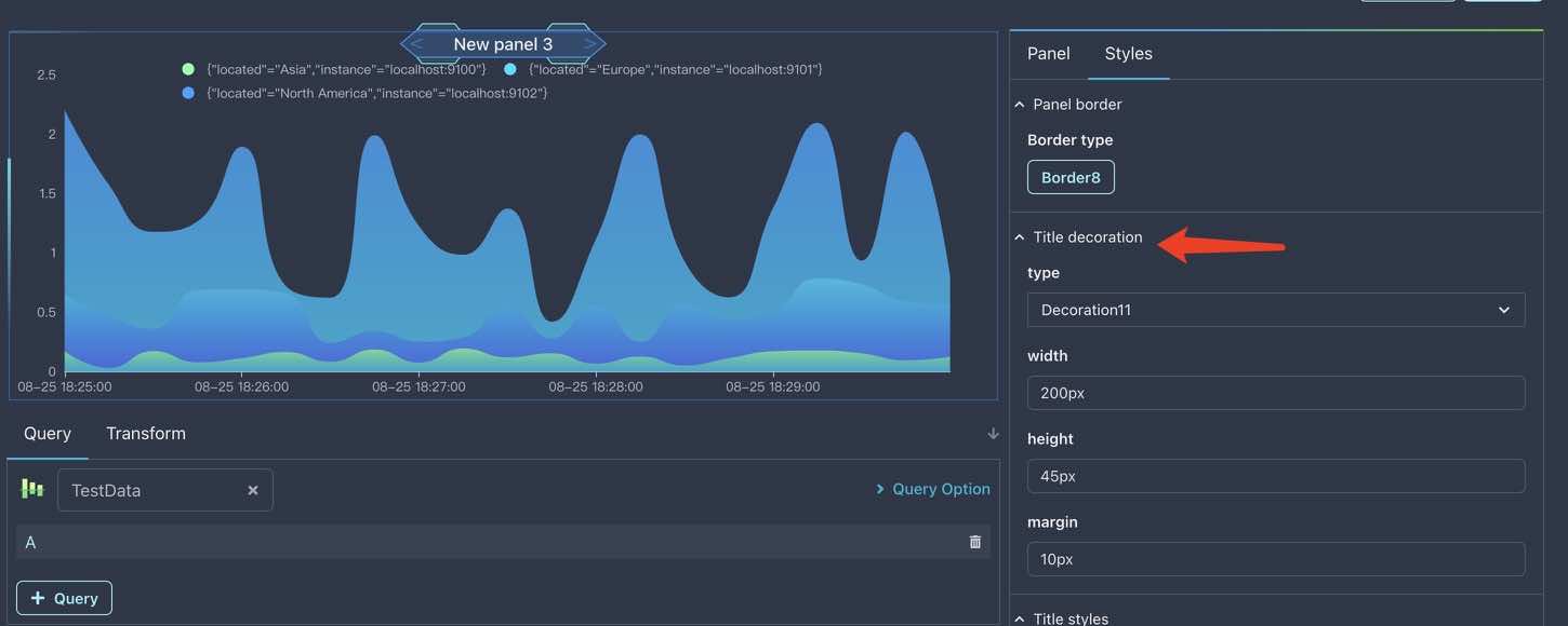
Panel border
As default, every panel has a border set to type Normal, you can change it to None or other border types.
Click the button in Panel border section, you can see a list of border types, select one of them to see the effect.
Wow, I have chose Border8 and it seems not bad, now let’s go on setting the title decoration.
Title decoration
Unlike borders, there are only a few title decorations now, let’s set it to Decoration11.
The default width of decoration is a little narrow, let’s change it to 200px.
If you set marin to another value, you should find there seems no effect at all. This is because the margin style is useful only when the title decoration is set to Decoration7.
After these changes, you should see the same result as I do:
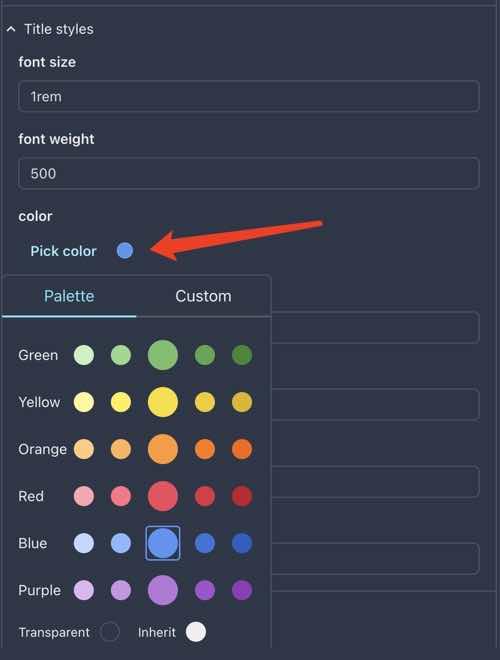
Title styles
The white title color is not good for us when add some decorations, let’s change it to blue:
The title position is just ok, so we don’t need to change them: the padding styles is for ajusting the position of panel title.
Panel decoration
The last one is panel decoration, it has much more types than title decoration, let’s set it to Decoration2 first.
Now its direction is horizontal, what if we want it to be vertical? Just enable the reverse option.
When enable reverse, the decoration has indeed became vertical, but it is not what we want, because it is in the middle of chart, it weird.
Now let’s move it to the right of chart by setting left to 51%(try to set to -51% and see what will happen).
This time it is in the right place, but it is so short that we can’t see it clearly, let’s change the height to 100%.
Wow, it’s height is large enough for us to see, but it’s position is not good, let’s change the top to 0px.
Finally, we have got a beautiful(maybe..) panel that looks like this: